
A new corporate website costs a Swiss SME between CHF 15,000 and 60,000 today. For more complex projects, considerably more. That figure appears in every quote. What rarely appears in the quote: what of it will still show results in two years. Leads, applications, quote requests, products sold.
The disillusionment often sets in after just six months. The site is live. It looks good. It's well liked internally. Only: it doesn't deliver.
This is rarely down to the design. Rarely the technology. Mostly it comes down to assumptions that nobody questioned during the project.
At the kickoff, everyone sits together. The managing director knows what their customers want. The marketing manager knows how the navigation should be structured. The agency nods, implements, delivers. What's missing is the moment in between: the moment someone says «Hold on, are we sure about this?» and then actually checks.
In technical terms, this moment is called user testing. The term sounds daunting. Too elaborate, too much like a research lab. The reality is different. Most useful tests don't require specialised software and can be carried out in a short amount of time.
Here are five assumptions that run silently through practically every SME website project. If you clarify even two of these before the next project kicks off, you'll save yourself an unplanned relaunch later on.
Why checking assumptions pays off
An assumption that turns out to be wrong once live usually costs five to ten times what it would have cost to verify it in advance. Poorly structured navigation that only becomes visible in analytics after six months means: redoing the concept workshop, redoing the sitemap, adjusting templates, redeploying. Depending on complexity, that quickly adds up to CHF 5,000 to 20,000. The same question can be clarified before the design sprint even starts, with a simple tree test taking just a few hours.
So the business case behind user testing isn't «we're making the website prettier». It's: we're preventing expensive corrections.
Broadly speaking, the methods fall into three effort categories:
Guerrilla testing (CHF 0 to 500). You or someone on the team carries out the testing yourselves, using existing tools and people from your network. No professional recruitment, no external moderator. Fast, cheap, and experience shows it delivers 60 to 70 percent of the insights of the more expensive variants.
Structured remote testing (CHF 500 to 2,500). Quickly set up with tools like UXtweak or Useberry. If needed, with external participant recruitment, defined tasks, and a standardised setup. Considerably more robust.
Moderated testing (CHF 2,500 to 6,000 per round). Classic tests with real target customers, moderated, usually remote via Zoom or Lookback, using a «think-aloud» protocol. Delivers the deepest insights, but requires planning and typically external support.
For most SME projects, a mix of category one and two is enough. Moderated testing typically only pays off for business-critical paths such as checkout, lead forms or applicant portals, or when the target audience is hard to reach.
Assumption 1: «Our visitors know what they're looking for on our site»
This is the most dangerous of the five assumptions, because it sounds so plausible from the inside. Of course visitors know what they're looking for. After all, they came to your website voluntarily. They googled you, or they have your business card in hand.
The reality is: visitors definitely have a goal. They just don't necessarily have the goal you have in mind for them.
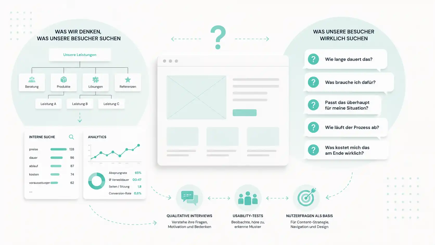
Companies usually build their navigation and homepage intuitively, following the logic of their own offering. The assumption behind this: whoever comes to our site is looking for our services. But visitors often aren't looking for ready-made offerings at all. They're looking for answers to concrete life or business questions. «How long does this take?», «What do I need for this?», «Does this even fit my situation?». Only once these questions are answered does the offering become interesting to them.
Websites that primarily reflect the provider's own internal logic force visitors to translate their life questions into the provider's offering categories themselves. That works for industry insiders, but not for the vast majority of first-time visitors. The gap between self-perception and user reality determines whether a website primarily informs, converts, or frustrates.
How to check what your visitors are really looking for
Analysis of internal search and analytics data. If your existing website has a search field, that's a goldmine. Web analytics also show you not just what people are searching for, but where they drop off, which pages they spend the most time on, and which pages they leave without clicking further. In most SMEs, this data already exists. It's just not being systematically evaluated.
Three to five qualitative interviews with people from your target audience. Not with customers you already have. With ones you'd like to have. 30 minutes per conversation, open questions: What was the last situation in which they looked for a company like yours? How did they go about it? What convinced them, what put them off? What you need is a listening attitude and an open set of questions, not software.
A moderated usability test with an existing version or a prototype. Five people from the target audience, one hour each, with concrete tasks. The real insight comes from the «think-aloud» protocol: test participants comment out loud on what they're doing and why. You hear not just whether they reach their goal, but why they click where they do, where they hesitate, and what they're missing.
Often, just a few conversations reveal a pattern that's been debated internally for a long time. Visitors can broadly be divided into two search types: task-oriented visitors know exactly what they want and fail because of the navigation. Orientation-seeking visitors don't yet know what they want and fail because of the content. Both groups need different answers. And you only recognise both groups once you look systematically.
Result of this assumption check: you have a list of the actual questions users are asking. This becomes the foundation for content strategy, navigation and homepage.
Assumption 2: «Our navigation is logically structured»
A website's navigation almost always reflects one of two things: either the company's organisational chart or management's view of the world. It rarely reflects visitors' mental model.
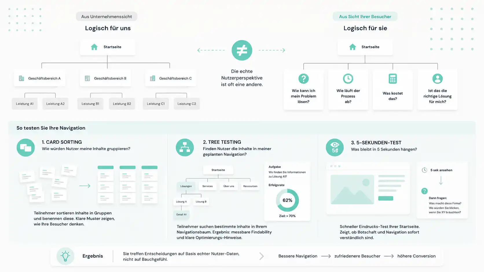
A typical pattern: a company has three business units and turns them into three navigation items. Technically correct, understandable internally. From an external visitor's perspective, often unusable, because the business units contain terms that outsiders don't know or would categorise differently. Or because what the visitor is looking for is spread across several units.
Another pattern: the main navigation reads «Solutions», «Services», «Expertise» and «Products». Four terms that are clearly distinct to insiders. Not to outsiders. The visitor clicks the wrong item, doesn't find what they're looking for, and leaves the site. You only see this in analytics, not in the design meeting.
How to check your navigation: card sorting and tree testing
These methods have become established for navigation topics:
Card sorting answers the question «How would users group my content?». You write all the important subpages on individual cards (digital or physical) and ask several people, independently of each other, to group them and give each group a name. After 10 to 15 participants, clear patterns emerge. The method can be carried out in a structured way online, or as a guerrilla variant with colleagues and acquaintances from the target audience. A few rounds are usually enough for a reliable trend.
Tree testing answers the reverse question: «Do users find the content in my planned navigation?». You give participants tasks such as «Where would you find information about XY?» and they click their way through your navigation tree. Result: a hard, discussable figure showing how many users find the right path. Anything below 70 percent findability is a serious problem. The real benefit: instead of «my gut feeling says this is intuitive», you now have «62 percent of testers found the right path». That changes how decisions are discussed within the team.
5-second test. The quickest check: you show someone your homepage for exactly five seconds, then hide it and ask «What does this company do? Where would you click if you needed XY?». The answers are often sobering. The test can be formalised with online tools or carried out entirely informally among colleagues. Either way, it quickly delivers an honest picture.
Ideally, you should run card sorting and tree testing before the design phase, not after. They don't need a finished page. They only need a content list and a navigation draft. That makes them cheap, efficient tests, since you can use them already during the concept phase.
Assumption 3: «Our copy is clear and understandable»
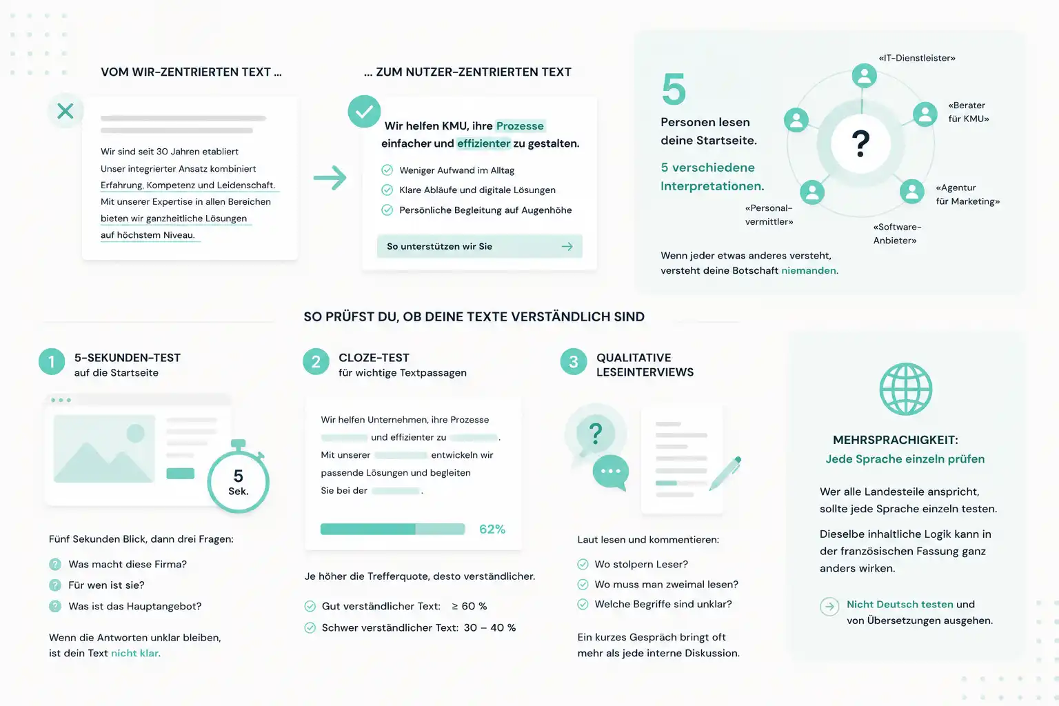
This assumption tends to fail for three particular reasons: technical jargon, marketing clichés, and a company-centric perspective. SMEs like to describe themselves from their own internal viewpoint: «We've been established for 30 years», «Our integrated approach combines…», «With our expertise in…». What the visitor actually takes away for themselves often remains unclear.
Particularly common are abstract service descriptions that carry little meaning externally: «Holistic consulting solutions for demanding situations», «Integrated concepts at the highest level», «Tailored support at eye level». Any of these sentences could appear on a trust company's website, at a marketing agency, or at an engineering firm. Sentences that fit anywhere say nothing specific anywhere.
A simple test quickly reveals how significant this problem is: five people from the target audience read the homepage and summarise in one sentence what the company does. It's not uncommon for five different interpretations to come back. Sometimes three or four people are so far off that the page's original intent is no longer recognisable at all. Fixing this issue usually doesn't require additional development work, just an afternoon of focused copywriting.
How to check whether your copy is understandable
5-second test on the homepage. Same principle as with navigation. Five seconds looking at the homepage, then three questions: What does this company do? Who is it for? What's the main offering? If the answers stay unclear, your copy isn't clear. Remarkably often, five tests produce five different interpretations of what the company actually offers.
Cloze test for key passages of text. An established trick from readability research. You delete every fifth word and ask test participants to reconstruct it. The higher the success rate, the more understandable the text. Well-written texts aimed at a lay audience achieve 60 percent or more. Technical texts that were meant to be lay-friendly often only reach 30 to 40 percent.
Qualitative reading interviews. Give someone from the target audience a printed or digital version of a page and ask them to read it aloud and comment as they go. Where do they stumble? Where do they need to read something twice? Which terms don't they understand? A single short conversation often reveals several concrete wording problems at once.
For the actual copywriting work, one additional point is particularly worth noting in Switzerland: multilingualism is not a copy-paste matter. If you're addressing all language regions, each language should be checked individually. The same content logic can come across very differently in the French version, because linguistic register and rhetorical expectations differ. A common mistake is to test only the German version and assume the translations will automatically work.
Assumption 4: «Our form already works»
Forms, checkouts and contact request paths are the most business-critical points on any SME website. This is where an interested visitor turns into a lead, an application, or an order — or doesn't.
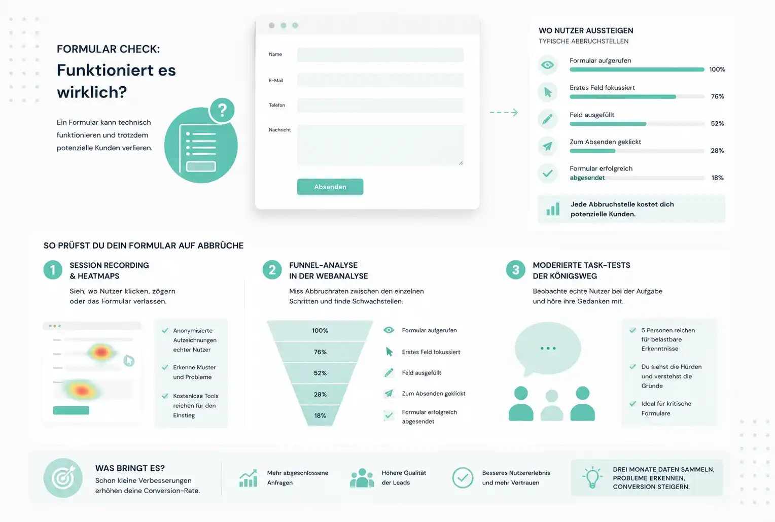
The assumption that a form «already works» is almost always based on an internal test after launch. Someone filled it in, the email arrived, so it must be fine. What this test doesn't show: how many real users tried and gave up, exactly where they dropped off, which field put them off.
How to check your form for drop-offs
Session recording and heatmaps. Specialised tools record real user interactions anonymously. You see where people click, where they hesitate, where they abandon the form. Both free and paid solutions exist on the market. A free version is almost always enough to get started. The skill lies less in choosing the tool and more in systematically reviewing the recordings and recognising recurring patterns.
Funnel analysis in web analytics. In your analytics tool, you can set up defined funnels (form opened, first field clicked, submitted). You see the drop-off rates between steps. Wherever they're highest, that's where the greatest potential for improvement lies.
Moderated task tests. The gold standard for business-critical forms. Five people from the target audience are given the task of submitting an enquiry or registering. You watch and listen to their thoughts as they go. After five tests, you know with high confidence where the hurdles are. The methodological advantage over pure session recording: you don't just see the drop-off point, you hear the reasoning that led up to it. That makes a huge difference for root-cause analysis.
For SMEs with moderate traffic, a combination of a simple session-recording tool and a cleanly set-up funnel in your web analytics is usually enough. Three months of data collection reliably brings the biggest form problems to light. For business-critical paths such as an application portal, configurator or checkout, a moderated test is also worthwhile. It pays for itself with just a few percentage points of conversion improvement.
Assumption 5: «Mobile already works»
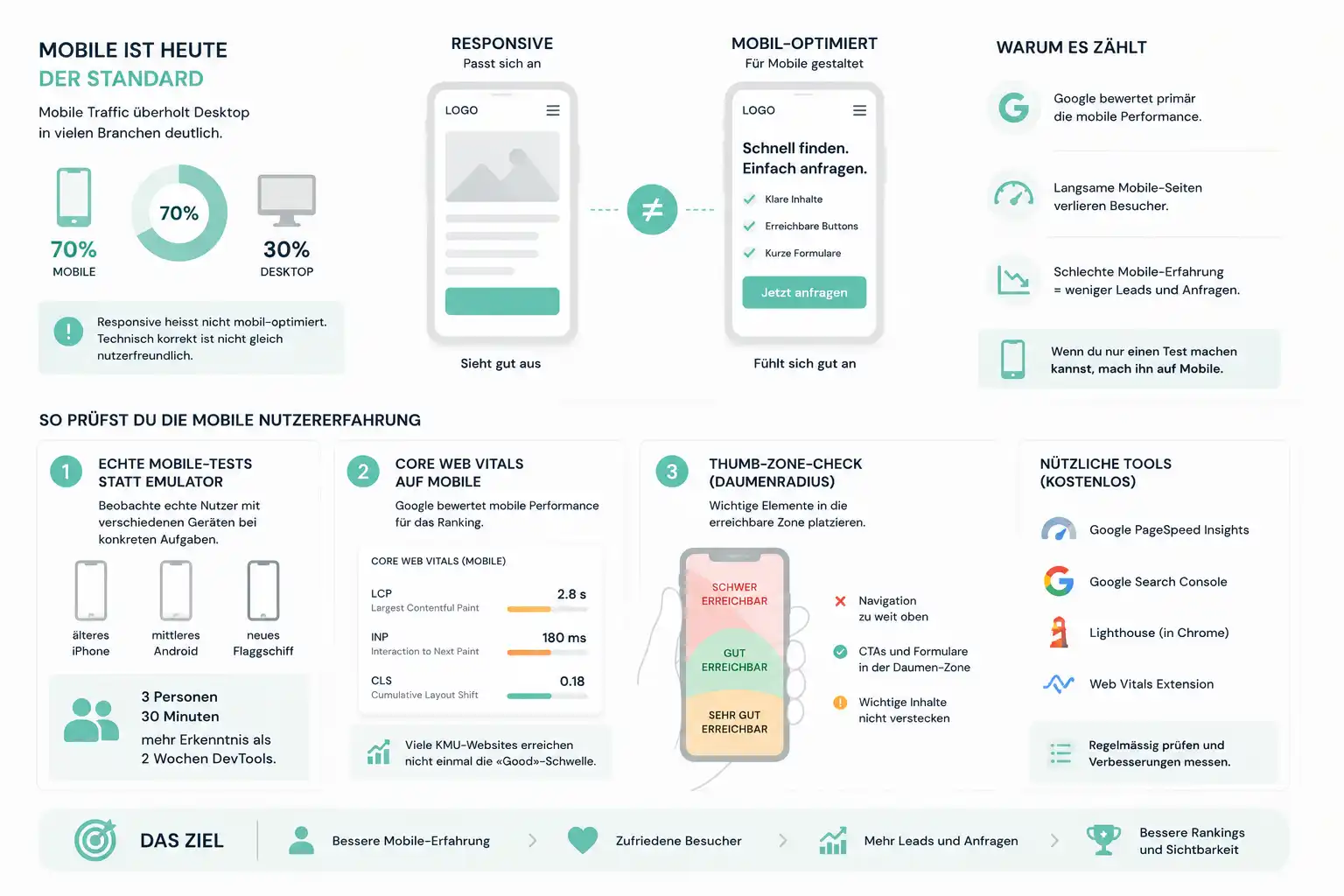
In many industries, the mobile share of traffic on Swiss SME websites has long overtaken the desktop share. Depending on the target audience, mobile shares of 60 to even 90 percent are everyday reality. And yet websites are still often conceived, presented and signed off primarily on desktop. In such projects, the mobile experience is a derivative, not something designed in its own right.
And even if a site is technically «responsive», that doesn't mean it feels good on a smartphone. These are two different things. Responsive means: the page adapts to screen size. Mobile-optimised means: the page is deliberately designed for the way people interact with a smartphone.
How to check the mobile user experience
Real mobile tests, not browser emulation. Chrome DevTools and similar tools simulate mobile, but they don't show what it feels like to operate a page with your thumb. Sit down with three people using different devices (an old iPhone, a mid-range Android, a large flagship) and have them carry out concrete tasks. You'll see more in 30 minutes than in two weeks of DevTools analysis. The reason: grip, thumb reach, tap accuracy and everyday distractions aren't captured by any emulator.
Core Web Vitals on mobile. For some time now, Google has primarily evaluated a page's mobile performance for ranking purposes. Poor scores here mean worse rankings, perceptibly slower load times, and higher bounce rates. You can check this with free Google tools. Many Swiss SME websites don't even reach the «Good» threshold on mobile. That's visibility lost to Google.
Thumb-zone check. When holding a smartphone in one hand, the thumb comfortably reaches only about two-thirds of the screen. Navigation, important CTAs and form elements should sit within this zone, not in the upper corner. Anyone designing primarily on a desktop monitor instinctively places elements where they create visual balance. That's not the same as where they're reachable with one hand. Easy to check, rarely considered.
For structured mobile tests with real users, the same method categories as above apply — simply carried out consistently on mobile. Results typically differ significantly from desktop tests. Making that gap visible is often the most relevant insight from such a project on its own.
A simple rule for SMEs with a limited budget: if you can only run one test, run it on mobile. It reflects the reality of your traffic better than any desktop analysis.
The most common objections from SME decision-makers
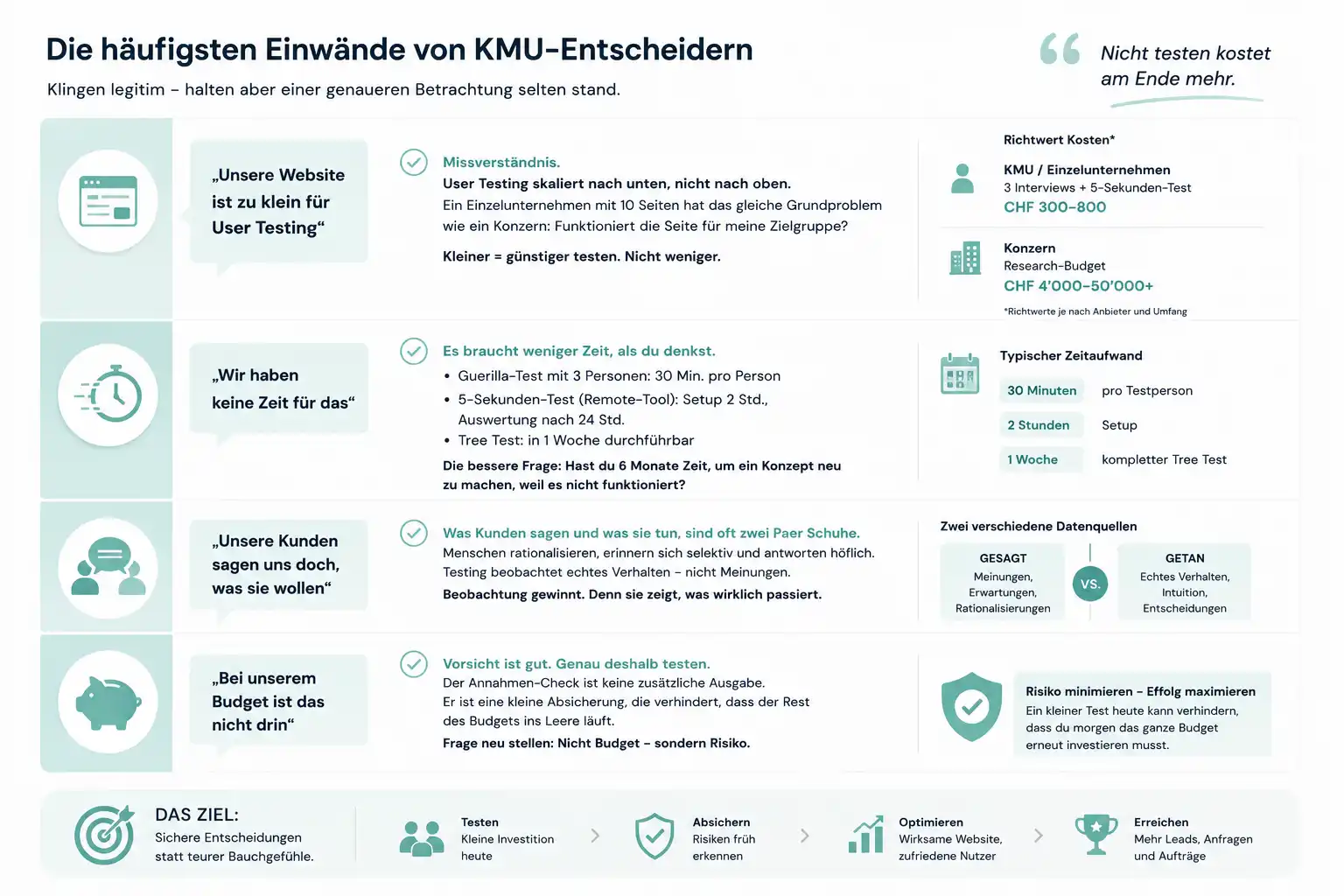
Whenever user testing comes up for the first time at an SME, almost the same objections surface every time. They sound legitimate, but rarely hold up under closer scrutiny.
«Our website is too small for user testing»
This is the most common objection. And it's a misunderstanding. User testing scales down, not just up from a certain company size. A sole proprietorship with a ten-page website has exactly the same underlying problem as a large corporation: does the site work for my target audience or not? The sole proprietorship gets the answer to that question with three interviews and a 5-second test for a few hundred francs. The corporation needs a research budget in the four to five-figure range for the same thing. The smaller you are, the cheaper you test. Not less thoroughly.
«We don't have time for this»
A guerrilla test with three people from your own network takes 30 minutes per person. A 5-second test with a remote tool is set up in two hours and evaluated 24 hours later. A tree test can be completed within a week. The real question isn't whether you have time for this. It's whether you have time to discover, six months after launch, that the navigation doesn't work and the concept needs to be redone. The time you invest in the testing phase saves you far more than that during operation.
«Our customers tell us what they want, don't they?»
That's true, and it's misleading. What customers say and what they do are two different things. That's not malicious intent, just psychology. Customers rationalise their behaviour, remember selectively, and answer politely to questions asked of them directly. A test, by contrast, directly observes what they do when they're not thinking about themselves. These two data sources contradict each other surprisingly often. Observation usually wins, because it shows actual behaviour, not a later self-report.
«We can't afford that with our budget»
This is the one objection that's sometimes justified, and yet almost always framed the wrong way. Anyone arguing from budget is usually doing so out of caution. They don't want to spend money carelessly. But that very caution is an argument for, not against, checking assumptions. It's not the additional investment that makes the project more expensive. It's the small safeguard that prevents the rest of the budget from being wasted. Once you frame the question this way, it's no longer a budget question but a risk question.
Where to start
Five assumptions, five methods. In practice, you don't need to check them all at once. Which question comes first depends on where you are in the project.
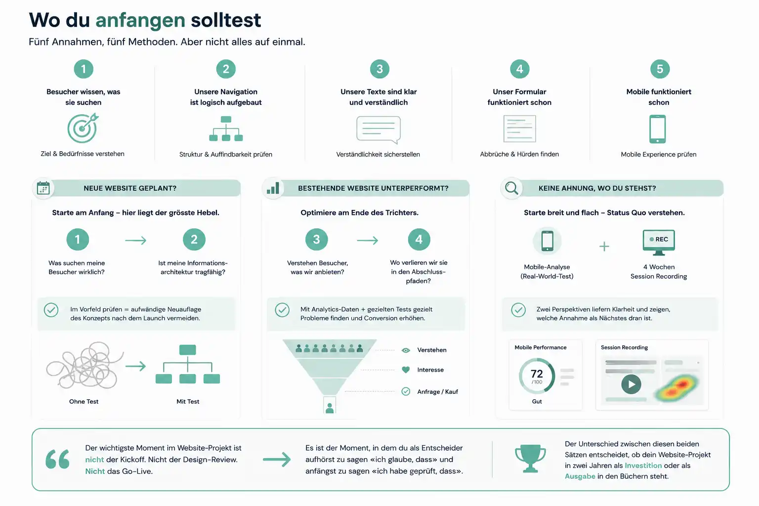
If you're planning a new website, the biggest lever sits right at the start. What are my visitors really looking for, and does my information architecture hold up? These are assumptions one and two. Checking them in advance saves you the costly job of redoing the concept after launch. And checking them before a single pixel is designed makes every subsequent design decision easier.
If your existing website is underperforming, the biggest lever sits at the end of the visitor funnel. Do visitors even understand what we offer, and where are we losing them on the conversion paths? These are assumptions three and four. Both can be clarified using existing analytics data combined with targeted additional tests.
If you don't yet know where you stand, start broad and shallow: an honest mobile analysis combined with four weeks of session recording. Two methods, two perspectives on the status quo. The results will almost automatically show which assumption to tackle next.
The most important moment in a website project isn't the kickoff. Not the design review. Not the go-live. It's the moment when, as a decision-maker, you stop saying «I believe that» and start saying «I've checked that». The difference between these two statements determines whether your website project shows up in the books in two years as an investment or as an expense.